
To provide handouts, or not to provide handouts? That truly is a good question. Some people are adamant that a good presentation doesn’t need them. However, some presentations serve the audience better if you do provide them. So, what are the best practices for handouts?
In this post, I’ll share the best practice tips for using handouts effectively.
![Best Practices for Handouts [Ultimate Guide]](https://publicspeakingsuperpowers.com/wp-content/uploads/2019/08/best-practices-handouts-1024x659.jpg)
What Is a Handout?
Merriam Webster defines a handout as a folder or circular of information for free distribution. However, in the public speaking world, it is so much more than that. What is the purpose of handouts? First, you need to understand why they are useful.
Why Use Handouts?
Handouts provide benefits to you as a speaker and to the members of your audience. When you provide a handout, you don’t need to pack so much information into your presentation that you overload your audience. More detailed information can be provided in the handout. They also help your message last longer with your audience, because they are able to take a reminder of you and your presentation home, making it easier for them to contact you later.
Your audience benefits because they can worry less about note-taking because they both have space to jot quick notes and they don’t need to write down your every word. If they want to know more about your topic, you’ve saved them some research time. And, if they want to refresh their memory about your presentation, more than likely your handout will be much easier to understand than their notes!
How Do You Use Handouts Effectively?
 If you want your handout to have the best chances of being kept and used, you need to use best practices for handouts. When you follow these guidelines, your audience members will be less likely to throw the handout away first thing, and more likely to refer to it later, thus getting you and your message into their mind space once again.
Here are some tips on how to structure a handout:
- Effective handouts reflect the storyline and information of your presentation.
When your audience peruses your handout, it should be clear that it is related to your presentation. The information should expand upon what you said, not be tangential. - Useful handouts provide additional information.
They highlight points in greater detail than you were able to cover during your speech. They may also include additional references and further reading, helping your listeners deepen their understanding of your topic. - The best handouts can stand alone.
If you provide the handout to people who missed your presentation, they will also gain value from it.
What Should Be Included in a Handout?
Just like your slide deck, your handout should contain only the information that is necessary to help your audience interact with or understand your content. The fewer pages you have the better. In most circumstances, one page is sufficient, but there are cases when you’ll need more. Here are some common handout ideas:
- Information from the slides—but expanded upon.
Your slides need to be simple and clean. Data Storytelling Evangelist Lea Pica suggests that “The better you’ve designed your live slides, the less sense they will make to an offline audience.” This may mean that not all the information you want to impart will be on them. Therefore, your handouts can include deeper information. - Guided space for taking notes.
Your handouts can include prompts for where to take the best notes. For example, you can include questions that you’ll answer in the presentation. Or you can include sentences with words missing, cueing them to pay special attention at those spots in your presentation.

- Additional resources and further reading.
Perhaps your presentation will inspire your audience to explore the topic further. You can help them by citing resources you’ve mentioned and suggest further reading they can do. - An action sheet.
Your handout can guide your audience in their next steps after your presentation. You can suggest actions they can take, provide journal prompts, or even leave space for them to jot down their aha moments. Some workshop presenters even allow time at the end of the workshop for audience members to prioritize their action notes and select one or more that they will take action on immediately.
When Should You Distribute Your Handouts?
 When to give out your handouts is a hotly debated topic. Some say you must distribute them before your presentation. Others argue that you should never do that and only hand them out at the end of your presentation.
However, the truth lies somewhere in between.
The type of presentation you are giving greatly affects when you should distribute handouts. For most presentations, it is better for you to distribute at the end of your speech. Here are some rules of thumb to help you decide when to deliver your handouts.
When to Deliver Before a Presentation
- If your presentation is very long, such as a full-day or half-day workshop
- If your presentation is highly technical and you need your audience to review something specific
- If you need to share information that is too dense for a slide, such as a large data table or complex graphic
- If you have participatory exercises that are better handled by a worksheet than a blank piece of paper
- If you need to facilitate note-taking by providing a pre-printed guide
When to Deliver After a Presentation
- Your handout would distract from, more than enhance, your presentation – rustling papers, reading ahead, etc.
- You need the elements of suspense or surprise in your presentation (you don’t want to handout spoilers!)
- The handout is more of a thank you gift than something that will help them absorb your information in real time
When to Deliver During a Presentation
Sometimes your handout meets criteria for both cases above. In that case, you might want to break up your handout and dole the pieces out at the appropriate points.
Additional Delivery Best Practices for Handouts

- When you need to distribute your handout at the beginning of the presentation, give your audience a moment to peruse it and become familiar with its contents. That way they won’t be leafing through it during your presentation and ignoring you.
- If you will deliver your handout at the end, let your audience know and give them a heads up of what it will include so they don’t take notes they don’t need to. For example, if you are going to give the information from your slides, they can relax and not feel pressured to write it all down or, nowadays, take pictures, which can obstruct the view of fellow audience members.
- If what you are talking about is not mentioned in the handout, let your audience know that too. This will encourage them to pay attention so they can take good notes.
How To Design an Effective Handout
How your handout looks—its design—affects how your audience members will react to it. Research has shown that visual design can affect a reader’s:
- Motivation to engage with the content (J. Smiley, 2004; E. Misanchuk, 1992; and R. Bell and J. Sullivan, 1981)
- Comprehension of the content (M. Gasser et al, 2006; J. Smiley, 2004; S. Walker, 2001; A. Hoener et al, 1997; K. Garofalo, 1998; C. Lewis and P. Walker, 1989)
- Recollection of the content (M. Gasser et al, 2006; J. Smiley, 2004; C. Lewis and P. Walker, 1989)
- Efficiency and speed in consuming the content (Smiley, 2004; A. Hoener et al, 1997)
Therefore, if you wish your handout to have legs—to be kept longer and make a strong impact on your audience—you will need to be mindful of these best practices for handouts design.
Make Your Handout Look Professional
Give your handouts as much time and care as you would your slide deck and your content. Allow plenty of time to design, proofread and make appropriate changes to the handout. If working with a designer, allow time for the back and forth approval process.
In addition, be sure the look and feel of your handout match your branding fonts, colors and imagery style. And, of course, be sure to include your contact information on every page!
Typography Basics
 Typography is the style, arrangement, or appearance of printed letters on a page. When selecting a font, you have two basic types to choose from: Serif fonts and sans-serif fonts. Serif fonts have little flourishes on them. Times New Roman and Georgia are commonly used examples. A sans-serif (literally “without serif”) does not have those flourishes. Helvetica and Arial are commonly used examples.
When selecting the fonts you will use, keep in mind these typography best practices for handouts:
- Use a font your audience is familiar with. According to Hoener et al, “people most easily read material printed in the typefaces with which they are most familiar.” This could mean use standard fonts like the ones mentioned above, or one that matches your branding. For example, the sans-serif font used on this webpage is Open Sans.
- Be sure the font you choose is legible. Some serif fonts are hard to read. If you must use a challenging font, do so sparingly. For example, the serif font used on this webpage is Bangers and is only used for headlines.
- Make sure the font size is large enough for your audience. According to R. Carter et al (2006), 9 to 12 point is standard for adults. However, if you have an older or younger audience, you’ll want the font size to be larger than that.
- Use no more than two fonts, one serif, and one sans-serif. In print design, serif fonts are considered more readable, however, the reverse is true online. Therefore, your printed handout would be best served by a serif font for the body and a sans-serif font for the headlines—unless you are trying to match your branding. Using different fonts for the body and headlines helps signal the beginning of different sections of your content.
- When using two fonts, don’t combine serif with serif fonts, nor sans-serif with sans-serif fonts. This can look bland, undifferentiated and less professional.

What You Need To Know About Graphical Elements and White Space
Research shows that graphics can distract from the content of your handout, so make sure that those you use are purposeful and enhance the text content. You can also use lines and shapes, such as bullets, squared-off sections, and lines between columns, to organize your page.
In addition to text and images, your handout design needs to have sufficient white space—the “negative” space where no text or images are. White space is the area between the different layout elements, the lines within and between paragraphs, and so on. White space does not necessarily need to be white, either. It can be a block of color, texture, patterns or even a faded background image.
The reason white space is so important is that it makes your handout more accessible and manageable. And research suggests that white space can deepen processing of the content and increase recall. One study indicated that the proper use of white space can increase comprehension by as much as 20 percent.
Think of white space as being like silence within a presentation. The silence helps structure your speech and gives your audience time to process what you’ve said. White space does the same thing for the readers of your handout.
The Pros and Cons of PowerPoint Handouts
 If you use PowerPoint, you are probably aware of its ability to print handouts based on your slides. This is a very tempting option, but if you want your handouts to be effective, think twice about using it.
Slides serve a different function from handouts. Communication expert Garr Reynolds says, “Attempting to have slides serve as both projected visuals and as stand-alone handouts makes for bad visuals and bad documentation.” Slides are visual aids specifically created to make your presentation more dynamic and engaging—they are not the content of your presentation. Handouts are supplemental and serve a supportive role—they need to be more detailed than your slides.
 Best-selling author and speaker Seth Godin never provides slides to his audiences. He says, “Without me, you wouldn’t have any idea what they mean. I am your guide.” Your slides should follow his lead.
If you are dead set on using your slide deck as your handout, keep in mind these PowerPoint best practices for handouts:
- Only print those slides that are necessary to convey information. You don’t need to include slides with only an image or quote on them, nor the title slide.
- Use the handout format of three slides per page. This makes them more legible and allows plenty of space for taking notes.
- Go beyond the slide handout. Create a useful summary or additional references sheet to go with it.
Bonus Handout Tip: How To Supercharge Your Handouts
An excellent way to increase the value of your handouts is to create an associated webpage. If you use this strategy, distribute a simple one- or two-page handout and indicate that even more information can be found on a specific webpage. This is especially useful if you are going to provide links to additional reading and resources online.
Added-value items you can include on this page are:
- Clickable links to resources mentioned in your presentation and/or your handout
- Recommended books with links to them on Amazon
- Downloadable worksheets, cheat sheets or action sheets.
Want to take this one step further? Create an opt-in incentive related to your presentation (perhaps the downloadable documents?). You can mention where to get it in the close of your speech or list it on your handout. Depending on the incentive you create, it can have the double benefit of increasing perceived value and growing your email list.
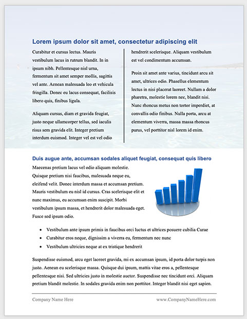
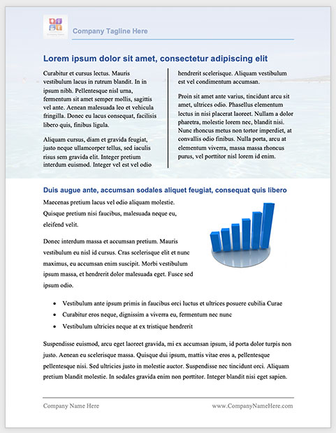
Before and After Presentation Handout Example
Here is an example of how a handout can be transformed from a plain document using MS Word’s standard styles into something more readable and professional. These before and after images were created using functions available in MS Word and applying the tips presented in this post. Of course, if you have your handout professionally designed, it will look even better. This is merely presented as an example of how you can do this yourself using a commonly used word processing application.


I hope this post inspires you to create outstanding, valuable and effective handouts for your next presentation.
Let’s talk about best practices for handouts!
 My goal for this post is to provide you with the best information available for creating effective handouts for your presentations. Did you find this post valuable? Do you agree with these best practices for handouts? Do you have any more wisdom about handouts to add? Please share your thoughts in a comment below!